In this week’s episode of the Extra Paycheck Podcast we’re talking about most common mistakes when it comes to web design.
Also available on: iTunes | Stitcher | Tunein | Google Play

We often talk about different strategies of improving our blogs in order to increase profit. Most often we concentrate on content creation, search engine optimization and other things every blogger must do. However this week I am taking a different approach.
In this episode I will talking about 8 most common mistakes when it comes to web design. Having great content is the most important part of a successful website on my opinion. However if your design isn’t great then you’ll certainly miss out a lot. Let’s look at some of these mistakes.
1. Custom Website Background
If you’re working with WordPress (and I hope you are) then your theme probably comes with a white or very light colored background. There is a reason for that. Text is easier to read on a white background and this color is very easy on our eyes. Do NOT change your background color and do not upload custom background images. Less is more in this case.
2. Custom Font
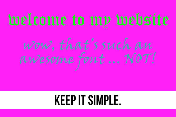
Every theme comes with a specific font, text color and size. You might be very tempted to use a funky font or a “unique” color but you shouldn’t. First of all if that custom font isn’t installed in your website visitor’s browser they’ll see a different font and you have no idea what exactly they will see. Also a “cute” font might look good to you but it’s incredibly hard to read for others. Changing your website text color isn’t a good idea either. Some colors and color combinations are hard on our eyes so it’s preferable to keep a very light background and a light text. Think of a typical book or even devices like Kindle. There is a reason why white background and dark text are so popular.

3. Keep Your Site Clutter-Free
Once again, less is more. I know that you want put EVERYTHING on your website. The problem is that your site visitors do not want that. The more distractions you put on your pages the more confused your visitors will get. Have you noticed how most of the great websites are very streamlined and very basic? If someone visits your home page and they see 7 banners, 14 blog posts, 23 images and a bunch of links – they’ll simply close that page. We don’t want to waste our time trying to figure out where to click. Put that ONE important thing on your page in the most obvious place and get rid of the rest. Have you seen my home page? There really isn’t much on it and it’s because I don’t want to scare away my visitors.
Another amazing example? Google.com. There is a logo and a search bar. That’s it.
4. Keep Your Menu Clutter-Free
I see a lot of beginner bloggers adding every single page and blog post into their top menu. Just like the website itself, your navigation should be simple and to the point. Do you really think your visitors will click on your “Privacy/Policy” page? Do you think your visitor will click on a menu button and read through all 24 items in your drop down menu? No. Reserve the top menu ONLY for your most important pages. Do not add ANY blog posts into your top menu either.
If you want to have a menu that links to all of your pages and posts then use the bottom menu for it.
5. No Clear Call To Action
This is similar to my 3rd point. You need to know what is that one thing you want your website visitors to do. You can’t expect your visitors to sign up to your email list and click on your links and make a purchase and like your Facebook page all in one session. Decide on the action you want your visitors to take and make it obvious.
Let’s go back to my home page. As soon as the website loads you see this:

I bet most people don’t even read the text. All they see is the green Get Started Here button and they click on it. At this point they are taken to my landing page where my main goal is to have them sign up to my email course. I make that rather obvious as well. Please note how I don’t even have a sidebar on that page. I don’t want to distract my visitors so I simply give them less options of leaving the site. The main call to action is signing up to the email list and I make it obvious.
Figure out your main call to action and make it obvious.
6. Using Banners Ads
Ditch the banner ads. They are distraction and most people have learned how to subconsciously block them out. I bet you can’t remember the last time you clicked on a banner ad. Why do you think your visitors will click on them? Assuming that your visitors do not use an Adblock like I do and they actually see your banners ads, chances are they’ll never click on them.
Replace these banners by links to your own pages. You can direct people to your most important pages or most popular posts. This will not only be valuable to your visitors, it will also generate more revenue for you.
7. Optimize Images Before Uploading
A big image reduces your website load speed. This means that if you put a big enough image in your post most visitors will simply close your site before it even loads. You can easily turn a 3Mb images into a 50kb image (60 times smaller) without losing any quality.
I use photoshop to save images before uploading them to the website. These strategies alone deserve a whole blog post and you can certainly find a lot of great info on this subject online. Faster loading website isn’t only great for your visitors, it will also rank better on search engines.
8. Cross Browser And Cross Device Testing
Finally you’re done with your website design and it looks amazing on your computer screen. But does it load and look nice on other people’s computers, tablets and smartphones?
You do not need to find friends with different screen resolutions and different smartphones to test this. It can be done from the comfort of your home by using free or paid tools. I often use Screenfly and BroswerShots – both are completely free. Within a few clicks you can see how your websites look on different screen sizes, browsers and devices.
I dig a lot deeper into these issues throughout the show so scroll up and press the PLAY button to hear the full episode.
You can subscribe to the Extra Paycheck podcast and review it on iTunes.
If you do have any comments or question, please do use the comment form below! I will answer every single one
– Alex


