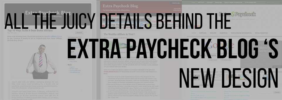
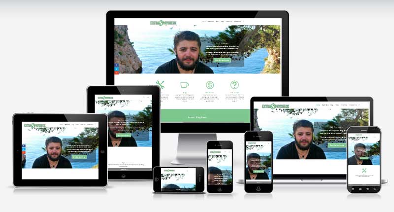
Extra Paycheck Blog has gone through 6 major redesigns and numerous small facelifts since 2008. To be honest I was never happy with how the site looked, until today. To be even more honest, I am still not 100% happy with the new design but I guess it’s the same for everyone; we always want more and always think there is room for improvement.
In this post I would love to share all the details behind this newest design. I didn’t simply want a site that looks okay, I also aimed for functionality and proper marketing. I would share a few ideas and experiences that might will help you improve your website and online business.
The Extra Paycheck Blog History
Here are some screenshots of Extra Paycheck blog on the older days. You can clearly see the progress over the years.
EPB 1.0 – Early 2008
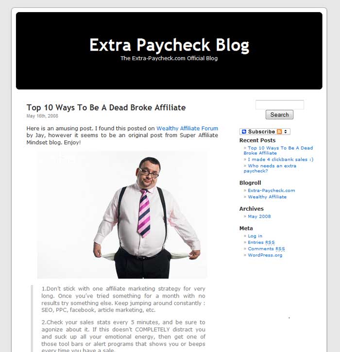
As you can see this was a very basic WordPress theme. Clean and simple. It didn’t even have a menu and the sidebar was completely useless.
EPB 2.0 – Late 2008
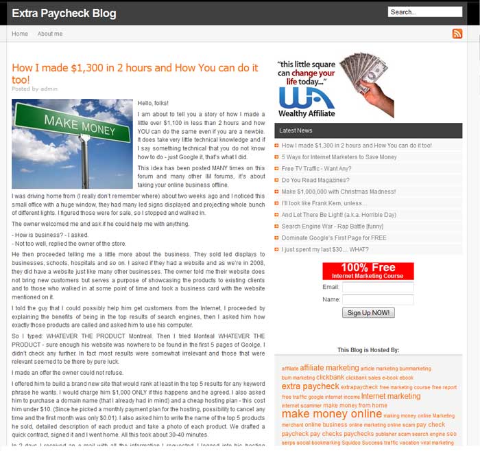
In less than a year I got tired of my blog’s look and switched to a different theme. As you can see the sidebar is almost as big as the main content section. What was I thinking?
EPB 3.0 – Mid-2009
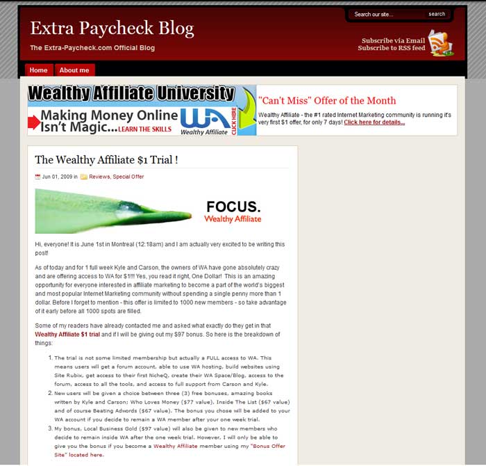
Another design that I though looked great. And maybe it actually did in 2009, I don’t remember anymore. Look at that RSS icon in the top right corner, a little man sitting on a toilet while reading a newspaper. Seriously?
EPB 4.0 – Late 2011
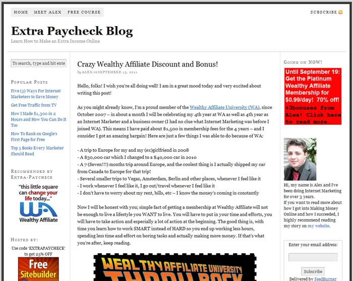
In early 2011 I changed the theme again. It was the same theme as you see above although with only 1 sidebar. Then by the end of the year I’ve decided that people will buy more if I have TWO sidebars… FAIL once again. That lasted for a while but I didn’t care much since my blog wasn’t active at that moment.
EPB 5.0 – 2012 – 2014
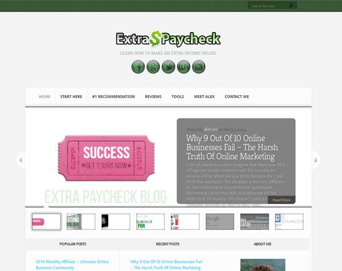
At some point in 2012 I’ve changed the website look once again. I bought a membership with Elegant Themes which gave me access to over 80 premium themes. I chose the Aggregator (which you see above) and I think this theme looked pretty great for 2012. I’ve kept this design for about 3 years and in late 2014 I finally started to work on yet another redesign, the one that you see on the website right now. I chose the Divi theme from ElegantThemes.
The Mockup
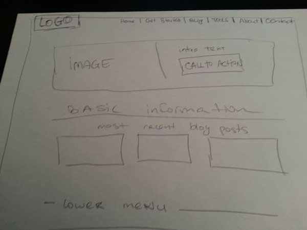
Before changing anything on the website I’ve decided to create a basic mockup of the site so I know where I’m going with it. I went old-school with it and drew up the basic idea of the site on a piece of paper. I left that paper on my desk so I could glance at it every day and make changes whenever something came to mind. After about a week I had a pretty clear idea about the look I wanted for my redesign.
The Theme
Once I had a clear idea of the look I was going for I had to find a WordPress theme to suit my needs. If you want a truly custom experience there are two most popular options on the market: Genesis and Divi. I went with Divi simply because I already had access to it (and I have previously used on my travel blog).
Divi is an amazing theme because it offers an incredible amount of customization. It kind of resembles Legos where you use lots of different building blocks to create your final product. I wanted images an text set up in a certain way, I wanted some pages being completely different from other pages, I wanted a LOT of freedom and Divi offered just that. Divi (and all Elegant Themes) come with access to support forum where you can get help whenever you’re stuck with something. Besides the official support there is a big Facebook group of Divi enthusiasts who always help each other. So I’ve selected the theme and started the process.
The Test Site
I wanted to simply install Divi on my site and start the redesign but I understood that it would take a while to get everything the way I wanted. Instead of activating Divi on Extra Paycheck Blog I installed it on a test website. That site is not indexed on Google so I could spend a lot of time playing with the site and no one would see any of it. You can do all of that testing on a test-site as well or on your desktop. There are free solutions that allow you to build and test a WordPress site offline, however I can’t recommend any since I haven’t used them personally.
Once I was happy with the test site I simply saved the created layout and uploaded the whole thing to Extra Paycheck, some time after midnight. I get very small amount of visitors at night so that was the perfect time to activate the new theme and set everything.
The Color Scheme
I used the general “green” color scheme on Extra Paycheck since 2012 and I’ve decided to stick to it for the new design as well. No, it’s not because green is the color of the money, our Canadian currency doesn’t have any green bills. Green is my favorite color and it’s also very pleasant. It doesn’t hurt the eyes (like red), it’s not heavy (like very dark colors).
The Logo
One of the first things I changed on the site was the logo. The old Extra paycheck logo showed its age by the gradient colors and its outdated font:

The idea of the new logo is the same as the old logo, however I got rid of the gradient, changed the font to a more modern one and used the same colors that are used in the site’s color scheme. Swapping that bold black border to a more discreet gray border was also a good idea. This makes the new extra paycheck logo fit better and look more like it’s a part of the site’s design:

The Home Page
Home page of any blog is probably not the most visited page. When people find your articles through the search engines they usually land to a specific post page, not your home page. However, those visitors might want to get a better idea of your blog and they will click on the “Home” button. In some cases people will go to your “home page” simply because the page they initially land on is confusing.
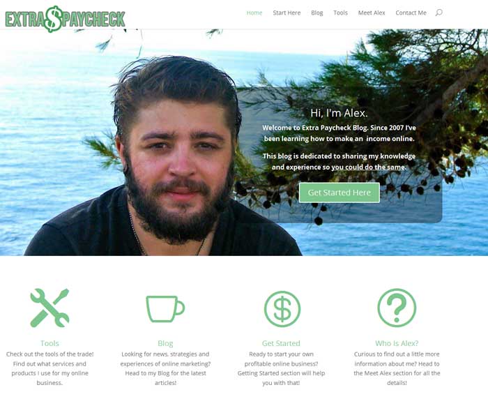
I’ve decided to make the most out of my home page:
This screenshots represents what most visitors will see when they land to my home page. I had to make a decision on what to put above the fold (the visible part of the site before scrolling down).
I used a large picture of myself which helps create a connection with the audience. When people see your face they usually think: “Oh, there is a real person running this site” which makes things a lot more interesting and personal.
To the right there is a short description of me and my website. Visitors leave a website within first 7 seconds if they don’t understand what the website is about so I made sure to make that clear.
Right underneath the description there is a very clear CTA (call to action). I don’t leave my visitors wondering “So what do I do next?”. I take them by the hand and tell them: “Don’t panic, simply click on that Get Started button. One step at a time”.
If you look further, there are 4 icons with small descriptions. These 4 items are links and they will lead you to my four main pages.
Scrolling further will reveal my two most recent blog posts. I am still deciding if I should leave it at two posts or more. Having a few blog posts displayed on the home page does 2 things. It shows the visitors that there is more content if that’s what they’re seeking. It also shows that the website is being updated with new content so it’s not a dead blog and worth coming back to.
For those who can’t stop scrolling there is also an opt-in form at the very bottom of the page. Once again, it’s a call to action (Get The 5 Day Course).
Please note that the whole page is very simple and clutter-free. There are no sidebars, no ads, no links to other websites. The information is clear so the visitors does not get overwhelmed or confused. Most importantly, every element on the home page has the same main role; taking a visitor to another page of the site.
The Sidebar Pages
I am using a sidebar on most pages and blog posts (you have probably noticed by now).
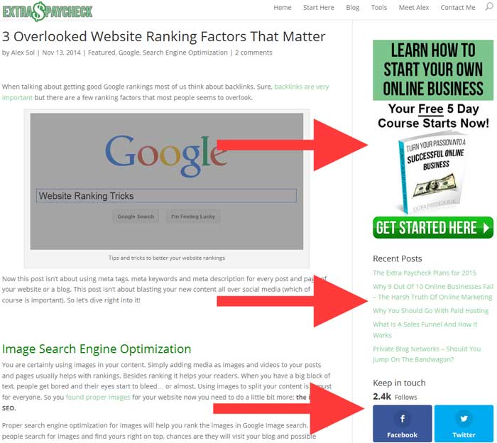
The sidebar is not intrusive and it’s goal is not to sell a product or make a few pennies by displaying an ad. At the very top you see another Call to Action (Get Started Here). It’s great when people come to your site but it’s almost impossible to get these visitors returning to your site. However, if these folks get advantage of your offer (free email course in my case) and sign up to your e-mail list then you can contact them whenever you want. That’s a great way to remind these visitors to come back to your site.
Under the Free Course offer you can find links to 5 most recent articles. This widget also helps keeping visitors on your site. They might click on another post then read another and another. Of course your content has to be interesting and helpful.
Last but not least, there is a section with Social links so people could follow the blog and get in touch with me through Facebook, Twitter and other mediums.
Below all of these sections there is yet another widget with 3 images, linking to 3 different pages on the site:
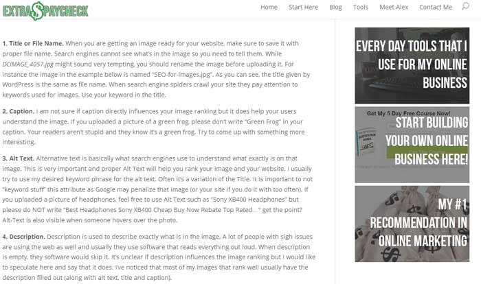
The widget that contains the 3 links is called a “sticky widget”. You scroll down the page and the widget scrolls as well. Once again, all three links will take you to my most important pages of the site.
Just like the homepage, the sidebar is designed to keep people within the website. No ads, no links to other sites.
The “NO” Sidebar Pages
Only a few pages on this blog do not have a sidebar. Get Started page and Wealthy Affiliate Review are among them. I’ve decided to disable the sidebar for those pages because I want the visitor to concentrate on content. Although I think my sidebars are not intrusive, they still might be a little distracting for some people. By removing the sidebar I am sure the visitor is fully concentrated on the main content of that specific page.
I will be testing the sidebars and its elements for the year to come so it might change quite a bit in the future.
The Email List
As I mentioned in the previous post I am going to re-build my email list in 2015. I’ve had a list of about 8,000 people in the past and I knew I had to get back at it at some point. Well, some point is now. I’ve spent my fair share of time getting myself updated on list building and email marketing, then I got to work. First of all I build an email course that I could offer to my subscribers. Then I started looking into implementation of the email form within my website.
What is the Two-Step opt-in?
I’ve read the same thing over and over on my favorite marketing blogs and I came to the conclusion that I had to try the “Two-Step Opt-in” process. The normal opt-in form show you 2 fields: Name and Email. However, it seems like site visitors became immune to opt-in forms. When people see you asking for their name and email address they automatically get turned off.
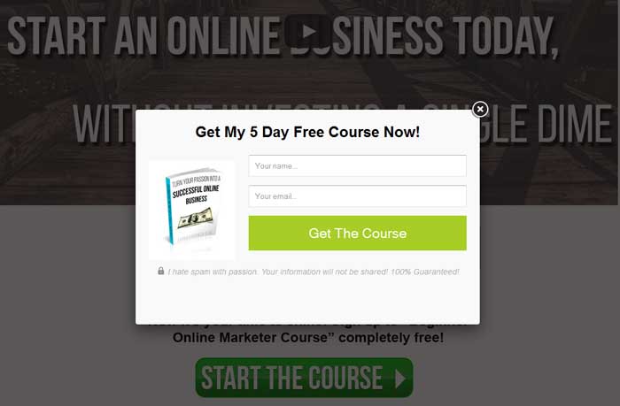
The two step process changes this perception. You simply use an appealing image (an interesting offer) and people click on it. Once they have clicked, a pop-up window opens where they can type in their email address. The difference is, they already clicked on the original image so they are interested in your offer and at this point giving out the email address doesn’t seem like an issue.
There are several ways to implement the two-step opt-in however I haven’t found a free solution. Some companies charge as much as $100 per month for a suite of tools that includes a two-step implementation. Many others charge less. I went with OptinClick WordPress Plugin which can be purchased for a one time fee of $29 (one site) or $49 (unlimited number of sites). It does exactly what I need it to do and I don’t have to keep paying for it every month.
Just like the other parts of the website, I’ll have to do a lot of testing with email marketing.
Site Speed
I have mentioned the importance of website’s loading speed in many blog posts. Redesign of Extra Paycheck was also about making the site load faster and be more mobile responsive.
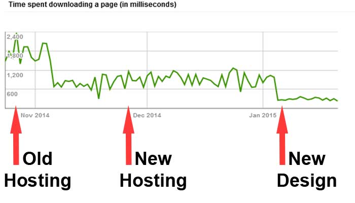
This screenshot comes from Google’s Webmaster Tool. The least time it takes Google to “download” your site the better.
The first part of the graph represents my site before I changed my web hosting provider. As you can see it’s slow. The second part shows the site with the new web host (and my old website design). And finally the third part represents the site with the current design! Basically the site is 6-8 times faster to load. This alone should boost up the user’s experience and rankings.
Besides the better loading speed the site is now fully responsive on all mobile devices!
Well that was a long post.
Running a website is a never ending process of making improvements, testing and fixing things. Although the site looks like I want it to I am still constantly tweaking it and making it better.
I am sure I forgot to mention a few things so don’t hesitate leaving a comment below this post.
– Alex
